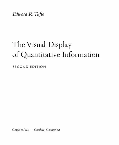
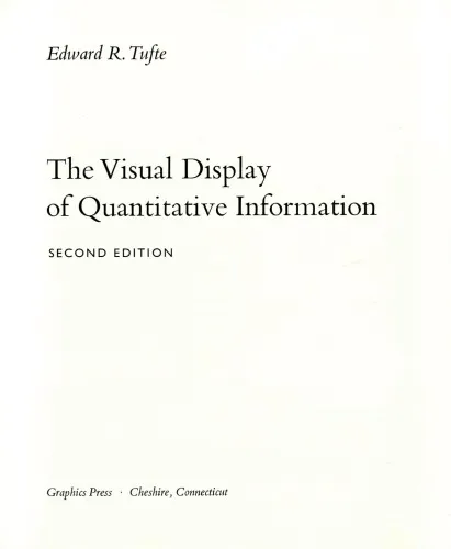
(with selectable text) The Visual Display of Quantitative Information
4.6
Reviews from our users

You Can Ask your questions from this book's AI after Login
Each download or ask from book AI costs 2 points. To earn more free points, please visit the Points Guide Page and complete some valuable actions.Related Refrences:
Welcome to an exploration of graphical excellence and the art of presenting data. The Visual Display of Quantitative Information stands as a seminal text in the world of data visualization, offering timeless insights and practical techniques for creating informative and beautiful data representations.
Detailed Summary of the Book
Edward R. Tufte's The Visual Display of Quantitative Information is a foundational book in the field of data visualization. With a focus on clarity, precision, and efficiency, Tufte charts a path through the rigorous world of statistical graphics and charts. The book emphasizes the importance of transforming complex data into intelligent and enlightening visualizations that reveal the story behind the numbers without distortion.
The book is divided into two main parts. The first part focuses on theorizing quantitative designs and critiquing deceptive and meaningless visualizations. Tufte provides an engaging discussion on the ethics of graphical representations, highlighting the pitfalls of exaggerating data through misleading graphics. He also introduces the concepts of data-ink ratio and chartjunk, which have become central teachings in the field.
The second part presents a beautifully curated collection of graphical success stories and nightmare scenarios. Here, Tufte meticulously analyzes the effectiveness of historical and contemporary graphics, offering a wide range of examples. From William Playfair's line graphs and scatterplots to Charles Minard’s famous depiction of Napoleon’s Russian campaign, each case study serves to illustrate principles of effective visual storytelling.
Key Takeaways
- Principles of Graphical Excellence: The book defines graphical excellence as that which gives the viewer the greatest number of ideas in the shortest time with the least ink and in the smallest space.
- Data-Ink Ratio: Tufte advocates for maximizing the data-ink ratio, essentially reducing non-essential ink to let the substance of the data shine.
- Simplicity and Clarity: Tufte insists on simplifying presentations to ensure clarity, suggesting that visual designs should be as simple as possible yet as complex as necessary.
- Critique of Chartjunk: The book strongly opposes unnecessary decoration in graphics, often referred to as chartjunk, which can distract from the data.
Famous Quotes from the Book
"Above all else show the data."
"Clutter and confusion are failures of design, not attributes of information."
"The greatest value of a picture is when it forces us to notice what we never expected to see."
Why This Book Matters
The Visual Display of Quantitative Information has established itself as an invaluable resource in the toolkit of anyone involved in data science, analytics, or any field requiring data communication. Its enduring relevance stems from its unwavering commitment to honesty and clarity, challenging viewers and creators alike to aim for truth in their visual representations.
In a world increasingly driven by data, it is crucial for professionals to present information in a way that is not only accurate but also easily digestible and engaging. Tufte's rigorous method serves as a vital guide for aspiring designers, ensuring that visualizations do not just inform, but also perform excellently in educating and enlightening audiences.
Ultimately, the book is a call to excellence, urging creators to respect their audience by upholding the highest standards of design and integrity. Tufte's work has shaped the industry norms we honor today and continues to inspire new generations of data storytellers.
Free Direct Download
You Can Download this book after Login
Accessing books through legal platforms and public libraries not only supports the rights of authors and publishers but also contributes to the sustainability of reading culture. Before downloading, please take a moment to consider these options.
Find this book on other platforms:
WorldCat helps you find books in libraries worldwide.
See ratings, reviews, and discussions on Goodreads.
Find and buy rare or used books on AbeBooks.
1451
بازدید4.6
امتیاز0
نظر98%
رضایتReviews:
4.6
Based on 0 users review
Questions & Answers
Ask questions about this book or help others by answering
No questions yet. Be the first to ask!


![Data Mining Concepts and Techniques [Solution Manual]](https://s3.refhub.ir/images/thumb/Data_Mining_Concepts_and_Techniques__Solution_9192.webp)
