
Book guide and evaluation
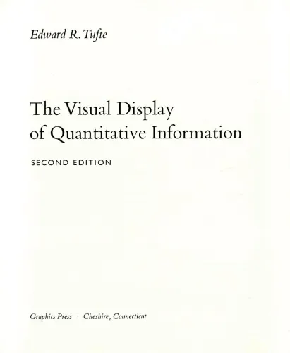
The Visual Display of Quantitative Information, 2nd Edition
Edward Rolf Tufte
English
Beginner
Business Intelligence
5.0 / 5
0 reviews
2000
Published
191
pages
549
views
The Visual Display of Quantitative Information, 2nd Edition - Introduction "The Visual Display of Quantitative Information, 2nd Edition" by Edward Rolf Tufte is a comprehensive exploration of how to effectively and beautifully present complex data. First published in 1983
Before you read
What will you get from this book?
The Visual Display of Quantitative Information, 2nd Edition - Introduction
"The Visual Display of Quantitative Information, 2nd Edition" by Edward Rolf Tufte is a comprehensive exploration of how to effectively and beautifully present complex data. First published in 1983 with a subsequent edition in 2001, this book remains a seminal piece in the field of data visualization, blending art and science to guide readers on showcasing quantitative information in a compelling and informative manner.
Detailed Summary of the Book
This book is a deep dive into the principles and practices of creating graphical representations of data that tell a clear and informative story. Edward Tufte masterfully combines his expertise in statistics, design, and storytelling to help readers understand how to avoid the pitfalls of poor data visualization. Throughout the book, Tufte emphasizes the importance of precision, accuracy, and efficiency in the graphical presentation of data.
The book is meticulously structured, beginning with a historical overview of quantitative graphics, highlighting key innovations and the evolution of data presentation over centuries. Tufte's insights into historical data graphics provide context and grounding for the modern techniques he advocates.
Tufte introduces several groundbreaking concepts such as "chartjunk," which refers to unnecessary or distracting elements in graphics that detract from the data's message. He advocates for simplicity and clarity, encouraging designers to respect the integrity of the data through minimalist design. The "data-ink ratio," another key concept introduced in the book, emphasizes maximizing the amount of information shown clearly and cleanly without superfluous decoration.
With numerous examples and illustrations, Tufte demonstrates how effective design allows data to speak with honesty and precision. He challenges the reader to think critically about every element in a visual display and to focus on clarity, simplicity, and efficiency in conveying quantitative information.
Key Takeaways
- Visual integrity is essential in data presentation to maintain credibility and clarity.
- The avoidance of chartjunk ensures that graphics are not only clear but also engaging.
- The data-ink ratio should be maximized to focus on the essential information within the display.
- Simplicity and clarity in design can greatly enhance the communication of complex information.
- The historical context of data visualization provides valuable insights into modern practices.
Famous Quotes from the Book
"Graphical excellence is that which gives to the viewer the greatest number of ideas in the shortest time with the least ink in the smallest space."
"Above all else, show the data."
Why This Book Matters
"The Visual Display of Quantitative Information" is crucial not only for data analysts and statisticians but also for anyone involved in the communication of complex data—business professionals, educators, journalists, and designers alike. This book sets the standard for creating high-quality graphical displays of quantitative information. It distills complex theories of design and representation into usable strategies and thought processes that support impactful data visualization.
In an age where data-driven decision-making is paramount, Tufte's work provides timeless guidance on how to ensure that quantitative data is communicated clearly and compellingly. The principles outlined in the book resonate in countless areas, influencing how data is taught, understood, and applied across various disciplines. Understanding and implementing these principles can dramatically enhance your ability to influence through visual storytelling, making this book an indispensable resource in the continued pursuit of data literacy and effective communication.
Ask this book
Your question is answered in the context of this title and author. Each answer uses 2 points.
Sign in to ask the book assistant.
Reader reviews
0 reviews, 5.0 average out of 5
No reviews yet
If you have read this book, help the next reader with your experience.
Write a review
Sign in to publish a review.
Reader questions and answers
Ask a focused question and learn from the community.
Sign in to ask or answer a question.
No questions yet
Be the first to ask a clear, useful question.
What to read next
Related references that continue this learning path.

(with selectable text) The Visual Display of Quantitative Information
Edward R. Tufte
2001
View book