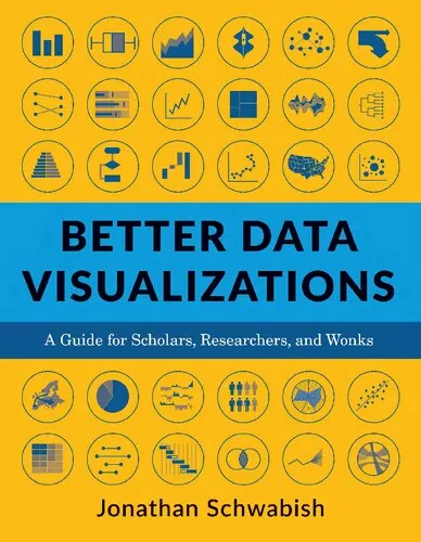
Better Data Visualizations: A Guide for Scholars, Researchers, and Wonks
4.4
Reviews from our users

You Can Ask your questions from this book's AI after Login
Each download or ask from book AI costs 2 points. To earn more free points, please visit the Points Guide Page and complete some valuable actions.Related Refrences:
Now more than ever, content must be visual if it is to travel far. Readers everywhere are overwhelmed with a flow of data, news, and text. Visuals can cut through the noise and make it easier for readers to recognize and recall information. Yet many researchers were never taught how to present their work visually.
This book details essential strategies to create more effective data visualizations. Jonathan Schwabish walks readers through the steps of creating better graphs and how to move beyond simple line, bar, and pie charts. Through more than five hundred examples, he demonstrates the do’s and don’ts of data visualization, the principles of visual perception, and how to make subjective style decisions around a chart’s design. Schwabish surveys more than eighty visualization types, from histograms to horizon charts, ridgeline plots to choropleth maps, and explains how each has its place in the visual toolkit. It might seem intimidating, but everyone can learn how to create compelling, effective data visualizations. This book will guide you as you define your audience and goals, choose the graph that best fits for your data, and clearly communicate your message.
About the Author
Jonathan Schwabish is an economist and writer, teacher, and creator of policy-relevant data visualizations. He helps nonprofits, research institutions, and governments at all levels improve how they communicate their work and findings to their colleagues, partners, clients, and constituents. He is the author of Better Presentations: A Guide for Scholars, Researchers, and Wonks (Columbia, 2016).
Free Direct Download
You Can Download this book after Login
Accessing books through legal platforms and public libraries not only supports the rights of authors and publishers but also contributes to the sustainability of reading culture. Before downloading, please take a moment to consider these options.
Find this book on other platforms:
WorldCat helps you find books in libraries worldwide.
See ratings, reviews, and discussions on Goodreads.
Find and buy rare or used books on AbeBooks.
1350
بازدید4.4
امتیاز0
نظر98%
رضایتReviews:
4.4
Based on 0 users review
Questions & Answers
Ask questions about this book or help others by answering
Please login to ask a question
No questions yet. Be the first to ask!
