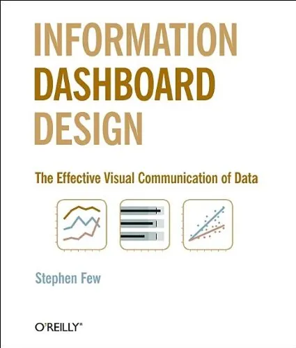
Information Dashboard Design: The Effective Visual Communication of Data
4.5
Reviews from our users

You Can Ask your questions from this book's AI after Login
Each download or ask from book AI costs 2 points. To earn more free points, please visit the Points Guide Page and complete some valuable actions.Related Refrences:
Introduction to 'Information Dashboard Design: The Effective Visual Communication of Data'
Welcome to an immersive exploration of data visualization with "Information Dashboard Design: The Effective Visual Communication of Data" by Stephen Few. This book is a quintessential guide for anyone seeking to design and implement effective dashboards that provide not just data, but valuable insights that drive better decision-making and strategic thinking. Stephen Few, a renowned expert in business intelligence and data visualization, takes readers on a journey to understand the nuances of designing dashboards that are both informative and aesthetically pleasing.
Detailed Summary of the Book
"Information Dashboard Design" is an authoritative source in the realm of data visualization and business intelligence, laying out a clear framework for crafting dashboards that truly enhance the comprehension and usability of data. The book starts by defining what a dashboard is and delves into the purpose it serves. Few debunks myths around dashboards and explains how they differ from conventional reports by offering a succinct overview tailored for quick assessment.
The book progresses by establishing the principles of effective dashboard design, emphasizing clarity, precision, and efficiency. Few introduces key design elements, such as the use of visual perception and cognition to optimize the user's ability to quickly and accurately interpret the data presented. He meticulously discusses common pitfalls to avoid in dashboard design, such as clutter, excessive use of color, or inappropriate chart types that can hinder data understanding.
Furthermore, the book provides practical guidelines for choosing the right metrics, selecting appropriate graphs, and arranging dashboard components effectively. With numerous real-world examples, Few illustrates both good and bad dashboard designs, giving readers visual context to reinforce his teachings.
Key Takeaways
- Understanding the fundamental purpose of dashboards and how they differ from traditional reports.
- Implementing design principles that focus on clarity and usability.
- Avoiding common mistakes in dashboard creation, such as clutter and misuse of visual elements.
- Effective methods for organizing information and employing visual perception to enhance data understanding.
- Real-world examples to demonstrate applicable principles and steer clear of poor design practices.
Famous Quotes from the Book
"Dashboards are not just a collection of data. They are an integrated display of critical metrics that guide our actions and decisions."
"A good dashboard engages the viewer on a moment’s notice and reveals truths that may otherwise go unnoticed."
Why This Book Matters
In an era where data is generated at an unprecedented rate, the need for effective communication tools like dashboards has never been greater. "Information Dashboard Design" stands out as an essential resource for professionals in various fields, including business intelligence, analytics, marketing, and management. Its relevance persists as organizations strive to harness the power of data for strategic advantage.
Stephen Few's insights empower readers to transform raw data into a narrative that not only informs but drives results. By adhering to the principles outlined in the book, practitioners can bridge the gap between data and informed action, ultimately contributing to more efficient and effective business operations.
Free Direct Download
You Can Download this book after Login
Accessing books through legal platforms and public libraries not only supports the rights of authors and publishers but also contributes to the sustainability of reading culture. Before downloading, please take a moment to consider these options.
Find this book on other platforms:
WorldCat helps you find books in libraries worldwide.
See ratings, reviews, and discussions on Goodreads.
Find and buy rare or used books on AbeBooks.
1416
بازدید4.5
امتیاز0
نظر98%
رضایتReviews:
4.5
Based on 0 users review
Questions & Answers
Ask questions about this book or help others by answering
No questions yet. Be the first to ask!


![Good Charts, Updated and Expanded: The HBR Guide to Making Smarter, More Persuasive Data Visualizations [Team-IRA]](https://s3.refhub.ir/images/thumb/Good_Charts__Updated_and_Expanded__The_HBR_Gu_31517.webp)
