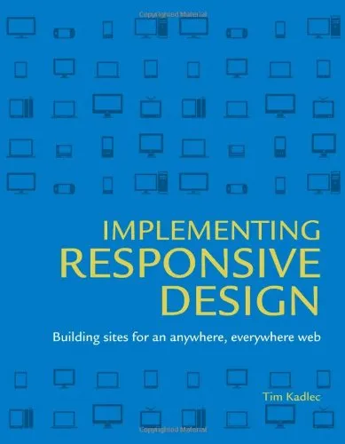
Implementing Responsive Design: Building sites for an anywhere, everywhere web
4.5
Reviews from our users

You Can Ask your questions from this book's AI after Login
Each download or ask from book AI costs 2 points. To earn more free points, please visit the Points Guide Page and complete some valuable actions.Related Refrences:
Introduction to "Implementing Responsive Design: Building Sites for an Anywhere, Everywhere Web"
The web has undergone a transformation. The rise of diverse devices—from tiny smartphones to expansive high-resolution desktops—has challenged how we think about designing websites. "Implementing Responsive Design: Building Sites for an Anywhere, Everywhere Web," written by Tim Kadlec, serves as both a practical guide and an inspiring manifesto for embracing this complexity through responsive design. This book is an essential read for developers, designers, and anyone else building for the web in our device-rich world.
Detailed Summary of the Book
At its core, "Implementing Responsive Design" provides a roadmap for creating adaptable and functional websites suited for users on any device. It addresses the shifting paradigms of web design, offering a hands-on, technical guide to creating flexible layouts, supporting an ever-expanding ecosystem of screen sizes and orientations.
The book begins with an introduction to responsive design principles, providing essential context for why responsive design has become such a critical component in the modern web strategy. From there, it dives into fluid grids, flexible images, media queries, progressive enhancement, and performance optimization—key techniques for building truly responsive sites.
"Implementing Responsive Design" doesn't just focus on abstract theory or isolated techniques. Instead, it walks readers through real-world scenarios and case studies, showing how to combine these tools into cohesive web experiences. By emphasizing a mobile-first approach, the book ensures that users on smaller screens receive prioritized, accessible, and high-performing websites without sacrificing functionality for larger displays.
With this book, Kadlec bridges the gap between responsive web design theory and practical implementation. The breadth of knowledge presented ensures that whether you're new to responsive design or seeking to refine and optimize existing practices, this book has something valuable to offer.
Key Takeaways
- The role of responsive design in the evolving web ecosystem and why it's a necessity, not a luxury.
- How to effectively use fluid grids, flexible images, and media queries to create engaging, scalable layouts.
- The importance of a mobile-first approach in designing accessible and fast-loading experiences for all users.
- Practical advice on performance optimization for responsive images, CSS, and JavaScript.
- Insights into progressive enhancement techniques, ensuring the site remains functional under varying browsing conditions.
- Case studies that provide actionable inspiration and real-world application of responsive design principles.
Famous Quotes from the Book
“Responsive design isn’t a skill set; it’s a philosophy.”
“The web does not start and stop on specific devices. It’s fluid, made to flow effortlessly across screens of all kinds.”
"If your site isn’t fast, it doesn’t matter how ‘responsive’ it is—users won’t engage with it."
Why This Book Matters
In the ever-evolving landscape of the web, keeping up with new devices and trends can feel overwhelming. "Implementing Responsive Design" is not just a technical manual—it’s a reflection of the dynamic and inclusive spirit of the web. It empowers designers and developers to anticipate and embrace change, rather than fear it.
Responsive design is no longer optional. With millions of users accessing websites from a diverse array of devices, the ability to deliver consistent and optimized experiences directly impacts user satisfaction and business success. This book matters because it not only teaches the technical "how" of responsive design but also delves into the "why," driving home its importance as a philosophy for modern web development.
Tim Kadlec's practical approach to responsive design principles, his focus on real-world implementations, and his vision for the future of web development make this book a cornerstone resource. If you're building websites today—or planning to build for tomorrow—this book provides the insights and tools you need to create experiences that delight users everywhere.
Free Direct Download
You Can Download this book after Login
Accessing books through legal platforms and public libraries not only supports the rights of authors and publishers but also contributes to the sustainability of reading culture. Before downloading, please take a moment to consider these options.
Find this book on other platforms:
WorldCat helps you find books in libraries worldwide.
See ratings, reviews, and discussions on Goodreads.
Find and buy rare or used books on AbeBooks.
1348
بازدید4.5
امتیاز0
نظر98%
رضایتReviews:
4.5
Based on 0 users review
Questions & Answers
Ask questions about this book or help others by answering
No questions yet. Be the first to ask!


