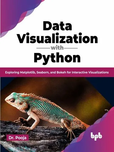
Data Visualization with Python: Exploring Matplotlib, Seaborn, and Bokeh for Interactive Visualizations
4.3
Reviews from our users

You Can Ask your questions from this book's AI after Login
Each download or ask from book AI costs 2 points. To earn more free points, please visit the Points Guide Page and complete some valuable actions.Related Refrences:
Introduction to "Data Visualization with Python: Exploring Matplotlib, Seaborn, and Bokeh for Interactive Visualizations"
Data visualization is no longer a luxury in the modern world of data science and analytics—it’s a necessity. Whether you're a seasoned data scientist or someone who’s just beginning to explore the fascinating realm of data storytelling, this book is crafted to provide a comprehensive guide to mastering the art of visualizing data with Python. In "Data Visualization with Python: Exploring Matplotlib, Seaborn, and Bokeh for Interactive Visualizations," my goal is to make this essential skill accessible to everyone with hands-on techniques, insightful examples, and a thorough exploration of Python’s most powerful visualization libraries.
The journey begins with understanding data visualization fundamentals: Why visualizations matter, when to use specific types of charts, and how to avoid common visualization pitfalls. We then dive deep into Python’s leading visualization libraries—Matplotlib, Seaborn, and Bokeh—exploring their strengths, differences, and use cases. By the end of this book, you will have mastered how to create static, animated, and interactive visualizations, enabling you to better analyze your data and share powerful, story-driven insights with your audience.
Summary of the Book
This book is divided into carefully crafted chapters that guide you every step of the way, from foundational concepts to advanced implementations. It starts by building your conceptual understanding of data visualization and why it plays a critical role in analytics and decision-making. We then delve into Python’s visualization ecosystem and examine all three core libraries in detail:
- Matplotlib: Learn how this versatile library serves as the backbone of Python’s visualization stack. We cover everything from basic line plots to highly customized charts.
- Seaborn: Understand how this library simplifies statistical data visualization and makes complex relationships in data intuitive through high-level abstractions.
- Bokeh: Explore this interactive visualization toolkit to craft dashboards, web-ready visualizations, and custom widgets for engaging presentations.
Additionally, the book covers advanced topics such as animation techniques, integrating visualizations with Jupyter Notebooks, and troubleshooting common issues in visualization workflows.
Each chapter includes real-world datasets and step-by-step examples that allow you to practice and immediately apply what you’ve learned. You’ll also discover creative tips for enhancing the presentation of your charts, making your visualizations not just informative but also compelling and persuasive.
Key Takeaways
- Understand the role of data visualization in analytics and storytelling.
- Master Matplotlib for creating precise, fully customizable visualizations.
- Leverage Seaborn to simplify statistical plots and analyze trends effectively.
- Build engaging, interactive visualizations with Bokeh for web-based applications.
- Learn how to choose the right chart type for the data and insights you want to convey.
- Gain hands-on experience with real-world examples and datasets.
- Explore advanced techniques such as animation, interactivity, and integration with Jupyter Notebooks.
- Discover how to troubleshoot common problems and avoid pitfalls in visualization design.
Famous Quotes from the Book
“A powerful visualization isn’t just about presenting data; it’s about revealing stories, provoking insights, and inspiring decisions.”
“A poorly designed chart can distort reality; a well-designed chart can illuminate the truth.”
“Interactive visualizations don’t just inform—they invite discovery, turning viewers into explorers.”
Why This Book Matters
In a world where data is doubling faster than ever, the ability to communicate complex datasets visually has become more critical than ever. However, creating effective data visualizations is not just about technical expertise—it’s about understanding your audience, the data’s context, and the message you want to convey. This book fills that gap by not only teaching the technical mechanics of working with Matplotlib, Seaborn, and Bokeh but also focusing on visualization best practices and storytelling principles.
Whether you analyze trends in climate data, track key business metrics, or present academic research findings, the techniques discussed in this book will empower you to become a more impactful communicator. With practical knowledge and a focus on creativity, this book equips you to transform numbers into narratives, making your work not only analytically rigorous but also visually compelling and memorable.
Free Direct Download
You Can Download this book after Login
Accessing books through legal platforms and public libraries not only supports the rights of authors and publishers but also contributes to the sustainability of reading culture. Before downloading, please take a moment to consider these options.
Find this book on other platforms:
WorldCat helps you find books in libraries worldwide.
See ratings, reviews, and discussions on Goodreads.
Find and buy rare or used books on AbeBooks.
1428
بازدید4.3
امتیاز0
نظر98%
رضایتReviews:
4.3
Based on 0 users review
Questions & Answers
Ask questions about this book or help others by answering
No questions yet. Be the first to ask!
![Building Data Science Applications with FastAPI: Develop, manage, and deploy efficient machine learning applications with Python [Team-IRA]](https://s3.refhub.ir/images/thumb/Building_Data_Science_Applications_with_FastA_31328.webp)
