
Book guide and evaluation
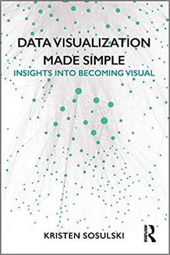
Data Visualization Made Simple: Insights Into Becoming Visual
Kristen Sosulski
English
Beginner
Economics
4.5 / 5
0 reviews
2018
Published
285
pages
145
views
Introduction to "Data Visualization Made Simple: Insights Into Becoming Visual" "Data Visualization Made Simple: Insights Into Becoming Visual" is a practical guide designed to empower anyone, from data enthusiasts to business professionals, with the tools and concepts necessa
Before you read
What will you get from this book?
Introduction to "Data Visualization Made Simple: Insights Into Becoming Visual"
"Data Visualization Made Simple: Insights Into Becoming Visual" is a practical guide designed to empower anyone, from data enthusiasts to business professionals, with the tools and concepts necessary to visualize data effectively. Written with clarity and precision, this book emphasizes understanding the complexities of data, transforming raw information into actionable insights through visual storytelling. As the world becomes more data-driven, being able to communicate data effectively is no longer optional—this book serves as your roadmap to mastering that essential skill.
Data visualization is both an art and a science, one that combines creativity with analytical rigor. This book demystifies the process, revealing strategies, tools, and principles to not just create visually appealing charts and graphs but to craft visual narratives that resonate with your audience. It emphasizes making data accessible and comprehensible, bridging the gap between numbers and actionable business insights. Whether you are a data scientist, designer, business leader, or student, this book provides the principles you need to become truly "visual."
Detailed Summary of the Book
The book is a comprehensive guide that breaks down the nuances of data visualization into digestible and actionable knowledge. It is structured to cater to beginners while also providing advanced concepts for seasoned professionals. Throughout the book, I leverage years of professional experience and teaching to provide real-world examples and practical tips on how to create impactful visualizations.
Readers are introduced to various frameworks and best practices, such as the importance of understanding the audience, the context of the data, and the story being told. It walks through a myriad of visualization techniques—from basic bar charts and pie charts to more complex approaches like dashboards, heat maps, and scatterplots. Each chapter takes a hands-on approach, enabling you to learn by doing as much as by understanding.
Tools like Tableau, Excel, and programming languages such as Python and R are discussed, giving readers an overview of how to use technology effectively for their projects. There’s also a heavy emphasis on principles of design and color theory, ensuring your visuals are not only functional but also aesthetically pleasing. Ultimately, the book ensures you’re equipped to tackle diverse challenges in data communication while adapting to a rapidly changing technological landscape.
Key Takeaways
- Data visualization is not about decoration—it's about communication. The goal is to make data understood, not just seen.
- Effective visualization begins with understanding both your audience and the question you are trying to answer with the data.
- Simplicity is often the most effective tool in your design arsenal. Focus on clarity rather than complexity.
- The choice of the right chart or graph depends on the data type, context, and the story you wish to convey.
- Mastering tools like Tableau or Python is important but understanding basic principles and frameworks for visualization matters more.
- Storytelling is key. Numbers need a narrative to create impact, and visuals amplify that narrative for decision-makers.
Famous Quotes from the Book
"Data visualization is both an art and a science—it requires storytelling skills as much as technical prowess."
"A great visualization doesn't just show data—it transforms it into meaningful insights that inspire action."
"Your audience should never have to ask, 'What am I looking at here?' Simplicity and clarity are your greatest allies."
Why This Book Matters
The modern world is awash with data, and those who can interpret and communicate it effectively hold a significant advantage. Data visualization is at the heart of this ability; it transforms raw numbers into meaningful insights, helping businesses, governments, and individuals make informed decisions. "Data Visualization Made Simple" matters because it provides a pathway for anyone to master this crucial skill.
Unlike overly technical or design-heavy books, this book bridges the gap by offering a balanced approach that caters to both analytical and creative thinking. It presents visualization as a universal language, one that can be learned and applied by anyone willing to invest the effort. In a world crowded with noisy, confusing charts and graphs, this book emphasizes the importance of clarity, precision, and ethical storytelling in the realm of data communication.
Whether you're a decision-maker looking to become more data-literate or a professional aiming to enhance your technical skills, this book will help you unlock new opportunities, gain confidence in communicating data, and create visuals that truly make a difference.
Ask this book
Your question is answered in the context of this title and author. Each answer uses 2 points.
Sign in to ask the book assistant.
Reader reviews
0 reviews, 4.5 average out of 5
No reviews yet
If you have read this book, help the next reader with your experience.
Write a review
Sign in to publish a review.
Reader questions and answers
Ask a focused question and learn from the community.
Sign in to ask or answer a question.
No questions yet
Be the first to ask a clear, useful question.
What to read next
Related references that continue this learning path.


Modern Computer Vision with PyTorch: A Practical Roadmap From Deep Learning Fundamentals to Advanced Applications and Generative AI, 2nd Edition
V Kishore Ayyadevara,Yeshwanth Reddy
2023
View book